Column Flow

Bric By Blocs Builder

Dynamic Flowing Content

Column Flow Bric makes it easy to create responsive, multi-column layouts in Blocs. Whether you’re formatting articles, structuring text-heavy pages, or designing a visually balanced layout, this bric provides a seamless way to distribute content across multiple columns—just like a newspaper or magazine.

Column Flow Overview

Key Features

  • Automatic Column Distribution – Text flows naturally across multiple columns, adjusting dynamically based on screen size.

  • Custom Column Count & Width – Define how many columns to use and their ideal width for optimal readability.

  • Adjustable Gaps & Rules – Fine-tune spacing between columns and add stylish dividing lines.

Works With Volt CMS!

Make use of Column Flow within Volt CMS, offering enhanced layouts for your project content.

What you get!

  • Column Flow Bric

  • Example Blocs Project

Requirements

  • Blocs 4 / 5 / 6

  • Bootstrap 5

Column Flow Settings

Flexy foot-2__Options_01

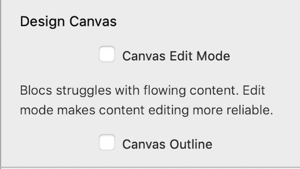
Design Canvas

  • Canvas Edit More - Remove columns on the design canvas. Note: the columns will stll be visabile on preview and export.

  • Canvas Outline - Displays an outline around the column in a colour matching the related Column Flow bric for easy identification.

Flexy foot-2__Options_01

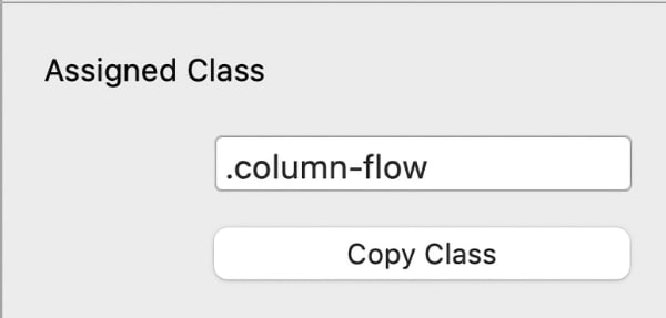
Assigned Class

  • Custom Class -Set the target class all these options will be applies to.

  • Copy Class - Copies the class to your clipboard.

Flexy foot-2__Options_01

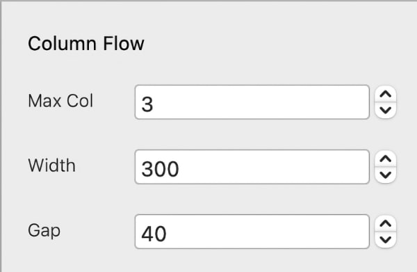
Column Flow

  • Max Col - Set the max number of columns to use.  Column Flow will dynamically adjust the column number based on the width of the view port and the number of pixels defined in the width field.

  • Width - Set the minimum width of each column. Helps to decide when Column Flow will adjust the number of columns being used for your content.

  • Gap - Sets the gap size between columns.  This is in pixels. 

Flexy foot-2__Options_01

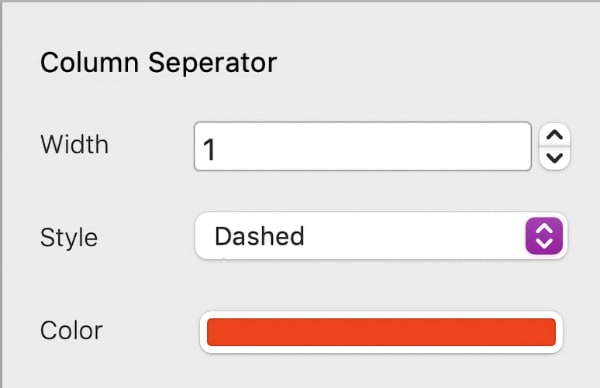
Column Separator

  • Width - Set the width of the column separator.  This is in pixels.

  • Style - Choose a style for the column seperator.

  • Colour - Choose a colour for the column seperator. This also supports global swatches.

Flexy foot-2__Options_01

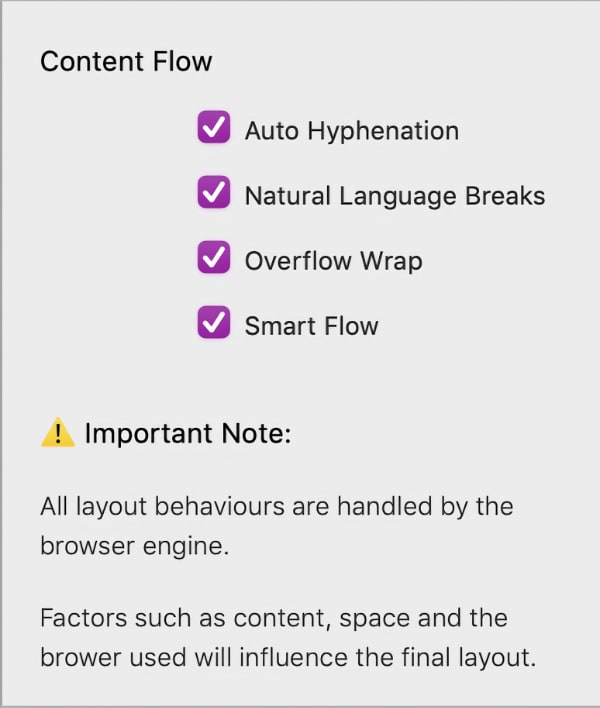
Content Flow

  • Auto Hyphenation - Adds hyphens only when needed at natural word breakpoints.

  • Natural Language Breaks - Uses natural language rules for breaking, avoiding abrupt mid-word breaks.

  • Overflow Wrap - Ensures long words don’t overflow but only breaks when needed.

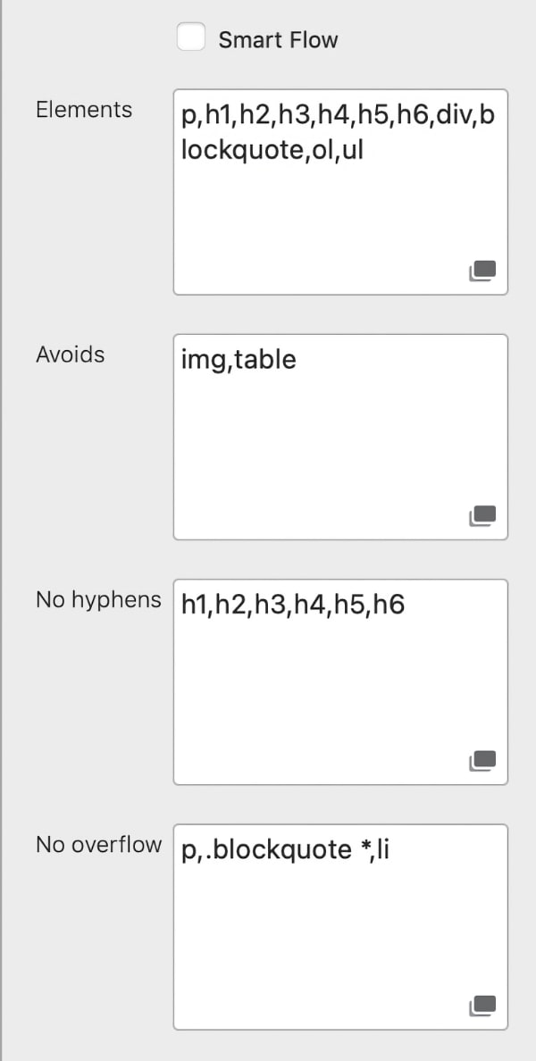
  • Smart Flow - Allow Column Flow to decide, or refine the content flow for your own usecase.

Flexy foot-2__Options_01

Advanced Options

Quickly link to tutorials and the Blocs Builder website for support.

  • Elements - These are the elements that are handled by the "window" and "Orphan" setttings.

  • Avoids - These elements will avoid breaking across columns.

  • No Hyphens - Prevent hyphens on these elements. Usually headings.

  • No Overflow - Helps ensures long words don’t overflow but only breaks when needed.

Flexy foot-2__Options_01

Extras

Quickly link to tutorials and the Blocs Builder website for support.

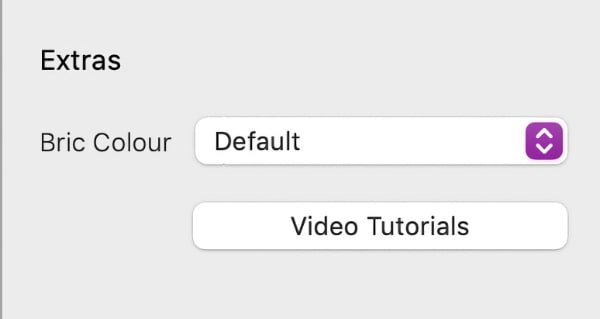
  • Bric Colour - You can fine tune the animation and state of the Any Video posters that have been excluded from the search, when not using Quick Search.

  • Video Tutorials - You can fine tune the animation and state of the Any Video posters that have been excluded from the search, when not using Quick Search.